Visualising data can be tricky: the human visual perception system is full of hacks built on top of poorly-designed hardware. Take, for instance, the colour of the sky. The air scatters sunlight through a process known as Rayleigh scattering, and the degree of scattering is inversely proportional to the fourth power of the wavelength. We should therefore see the most strongly scattered light, i.e. the shortest wavelength light – violet! That we don’t is (partly) because our eyes are not equally senstive to all colours (the other reasons being that the Sun emits less violet light, and more violet light is absorbed by the atmosphere).
Our brains also try to compensate for varying lighting conditions. Consider the following two pictures of Rubik’s cubes:
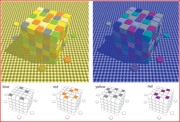
(taken from http://www.mattnewport.com/pics/colour-constancy.png)
The “blue” squares on the top of the left-hand cube are identical in colour to the “yellow” ones on the right! Their apparent colours are due to context-sensitivity in our visual system (for more information see Lab of Misfits).
You can download the original slides for this talk here.
This talk cribbed heavily from this set of Jupyter notebooks on data
visualisation:
https://github.com/UoMResearchIT/data-vis-truthiness-hurts
and as well as this talk on colourmaps in Matplotlib:
https://bids.github.io/colormap/
Plotting 2D data
Need to plot something with structure of various scales:
x = np.linspace(0, 6)
y = np.linspace(0, 3)[:, np.newaxis]
z = 10 * np.cos(x ** 2) * np.exp(-y)
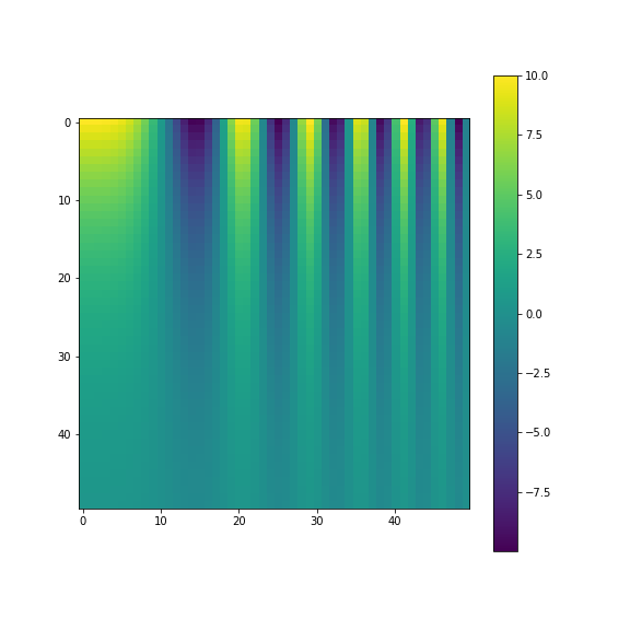
fig,ax = plt.subplots(1,figsize=(8,8))
ax_im = ax.imshow(z, cmap='jet')
plt.colorbar(ax_im);
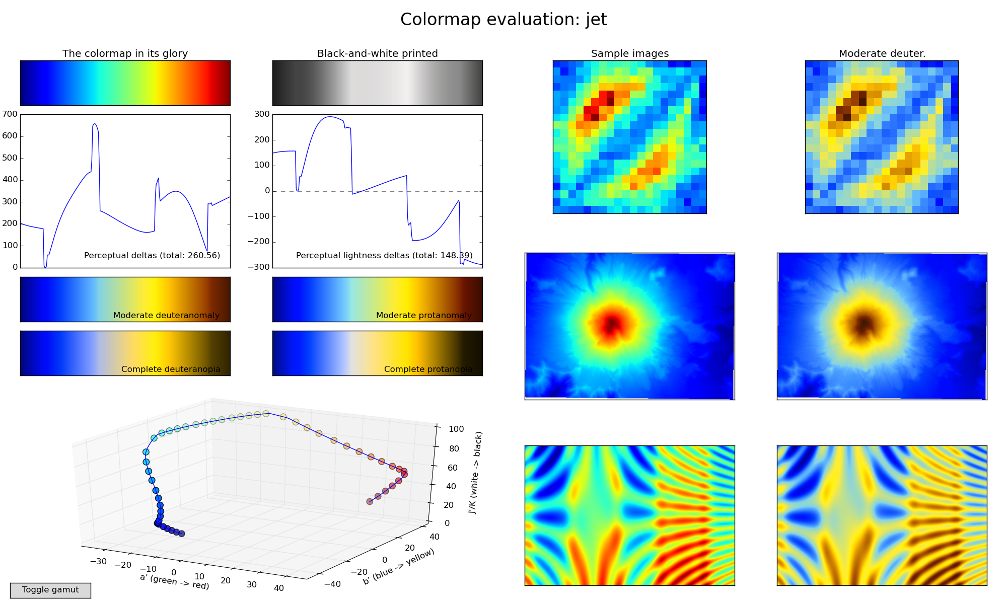
Let’s plot that with the commonly used “Jet” colourmap:
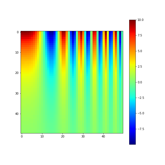
Notice the apparent strong features around 20 on the y-axis? Let’s dig a bit deeper.
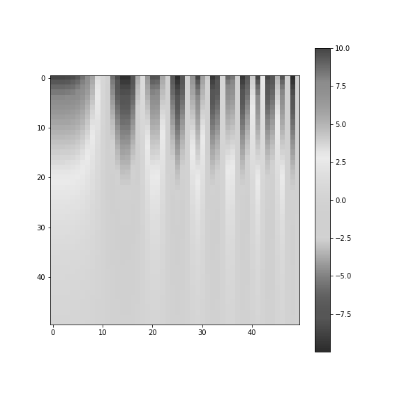
Convert to grey-scale
import matplotlib.colors as mpl_colors

def grayify_cmap(cmap):
    """Return a grayscale version of the colormap"""
    cmap = plt.cm.get_cmap(cmap)
    colors = cmap(np.arange(cmap.N))

    # convert RGBA to perceived greyscale luminance
    # cf. http://alienryderflex.com/hsp.html
    RGB_weight = [0.299, 0.587, 0.114]
    luminance = np.sqrt(np.dot(colors[:, :3] ** 2, RGB_weight))
    colors[:, :3] = luminance[:, np.newaxis]

    return mpl_colors.LinearSegmentedColormap.from_list(cmap.name +
           "_grayscale", colors, cmap.N)
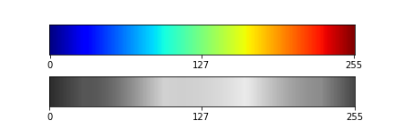
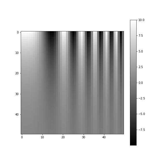
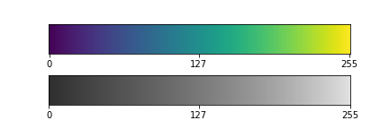
Jet colourmap converted to grey-scale
Jet colourmap
- Is this really what’s happening?
- Look at colourmap converted to grey-scale:
- Notice the banding?
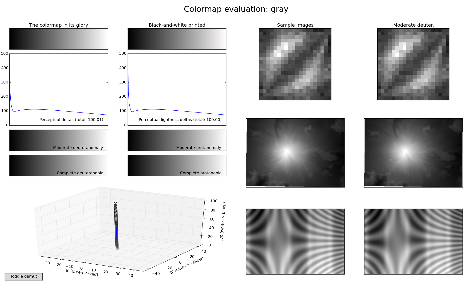
Actual grey-scale colourmap
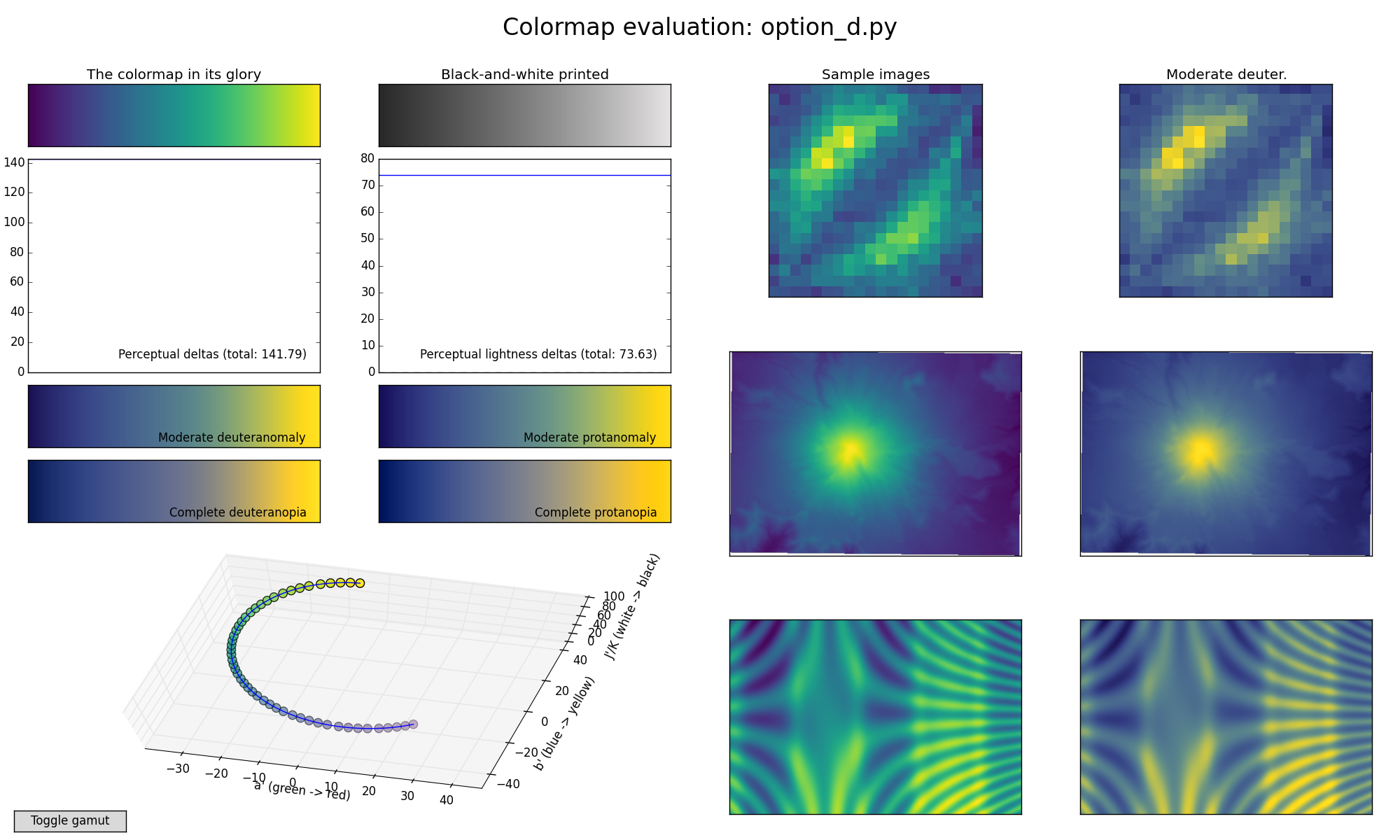
Viridis colourmap
Viridis colourmap converted to grey-scale
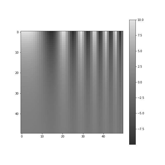
Viridis colourmap
- Compare the grey-scale versions of viridis and jet
- Imperceptible banding in viridis! “Perceptually uniform”
Other pitfalls
Colour-blindness
- Affects about 8% of men, and 0.5% of women
- Various kinds, most common of which is red-green colour blindness
- Don’t pick colour maps with both red and green
Diverging vs sequential vs qualitative datasets
- For diverging data (i.e. positive and negative values), need a good centre colour
- Paraview’s default colour map is ideal and scientifically designed
- Matplotlib, “RdBu” is probably best (though has red as “negative”)
- To use diverging colour schemes correctly, best to set min/max
values to plus/minus the max absolute value
- Careful with normalisations! Using the full dynamic range for both positive/negative makes the extreme values look equal in magnitude
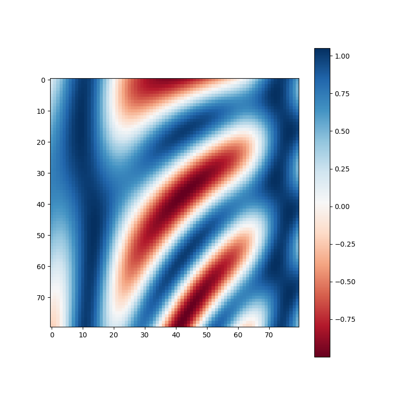
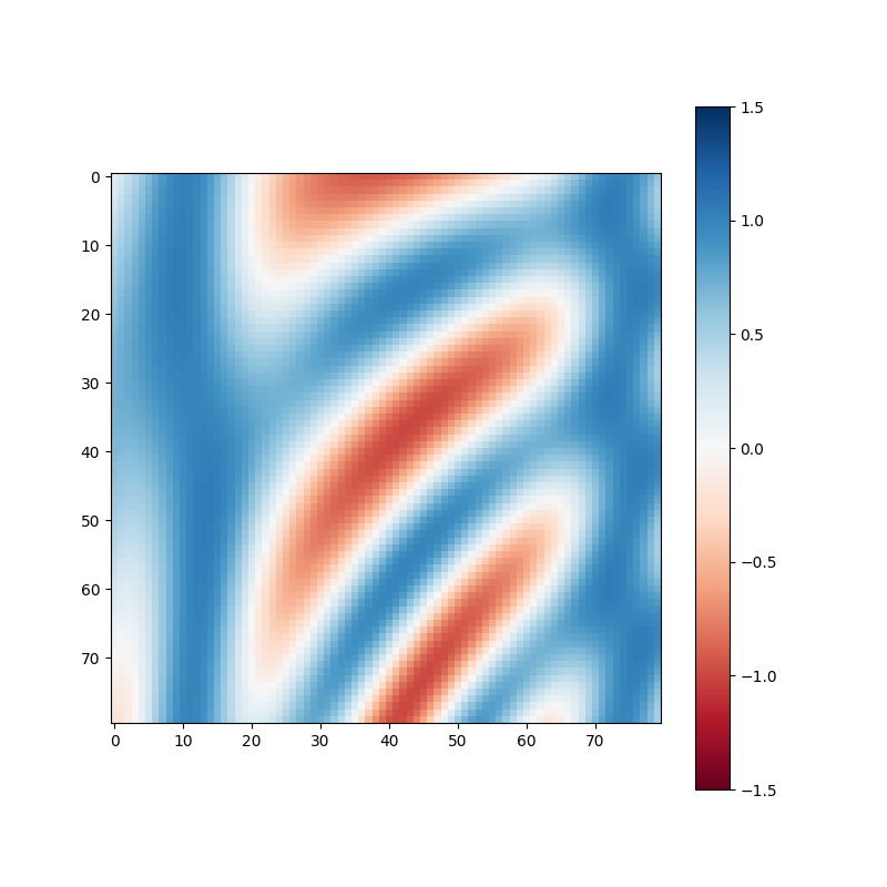
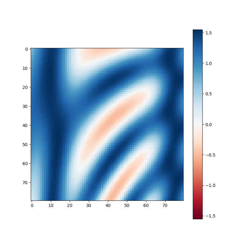
Positive and negative data
- Just plotted

- Plotted with
+/- max(abs(f))
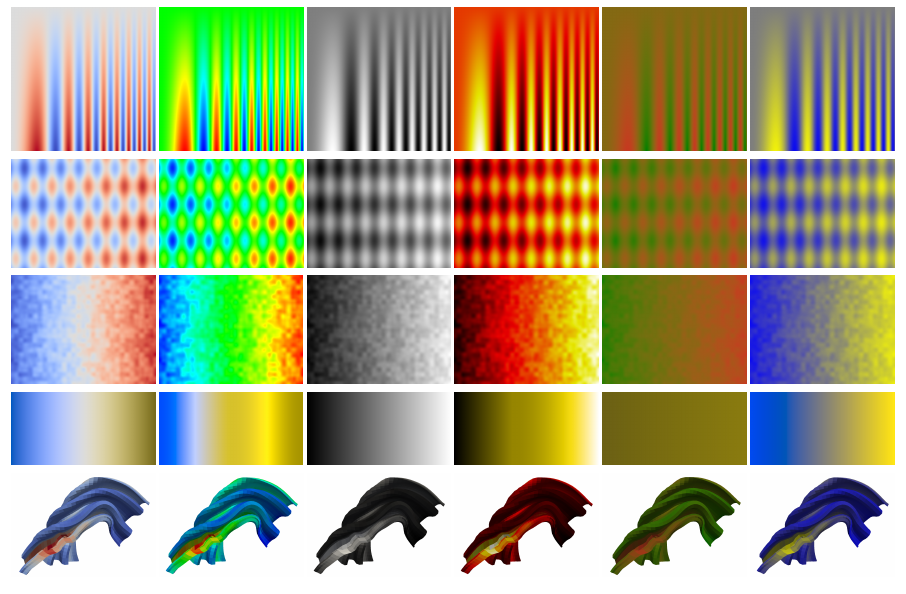
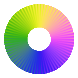
Cyclic/phase colour maps
- Much trickier!
- Need to cover large area of gamut (colour space) whilst being periodic
- End up either being “washed out” or with banding
- Desirable to have “main” colours at cardinal directions
- Need to be 2D colourmap for complex plane (magnitude and phase)
- See http://peterkovesi.com/projects/colourmaps/
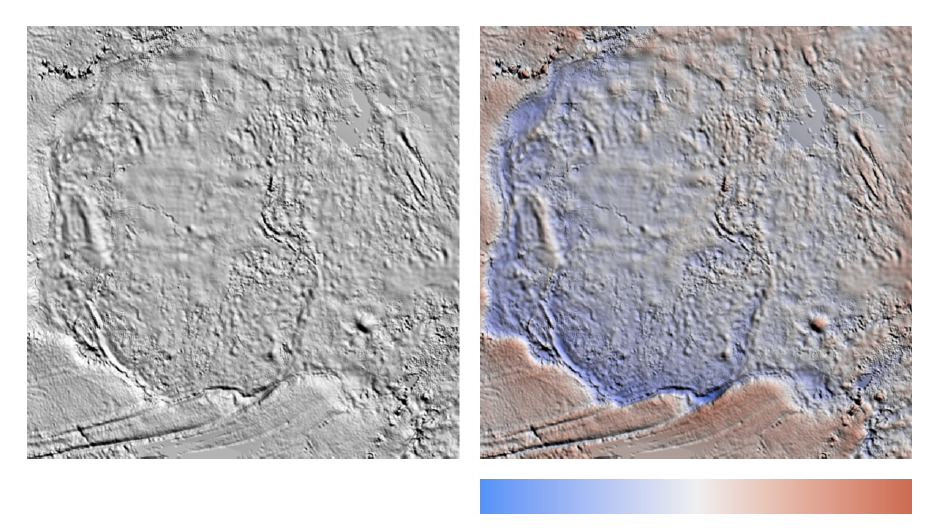
Colour maps for 3D images
- 3D images with lighting and shading can interfere with colour maps
- Choose an “iso-luminant” colour mapping
- Default colourmap in Paraview also designed for this
- Unfortunately, these tend to be “washed out” due to lack of saturated colours
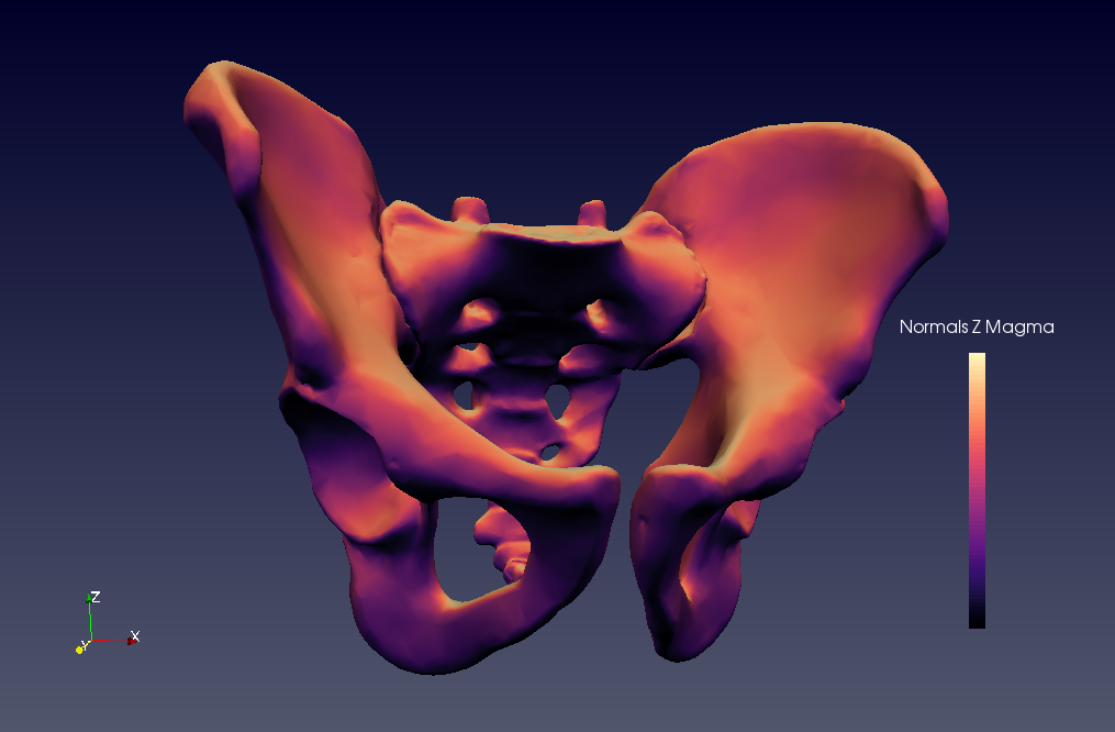
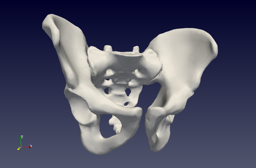
http://noeskasmit.com/colormaps-in-medical-visualization/
Good Colour Maps: How to Design Them, Peter Kovesi, https://arxiv.org/abs/1509.03700
Plotting line graphs
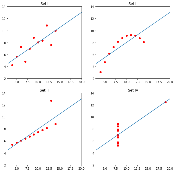
Anscombe’s Quartet
Four datasets with identical simple statistical properties (mean, median, range, etc.) that are immediately distinguishable once plotted:
Data Channels
In order of effectiveness:
- Quantitative Data:
- Position
- On dependent scales
- On independent/unaligned scales
- Length
- Angle
- Area
- Depth
- Luminance
- Saturation
- Curvature
- Volume
- Position
- Categorical Data:
- Spatial location
- Hue
- Motion
- Shape (Glyph)
Gestalt Principles of Perception
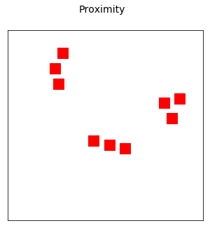
- Proximity - objects close to each other are seen as groups
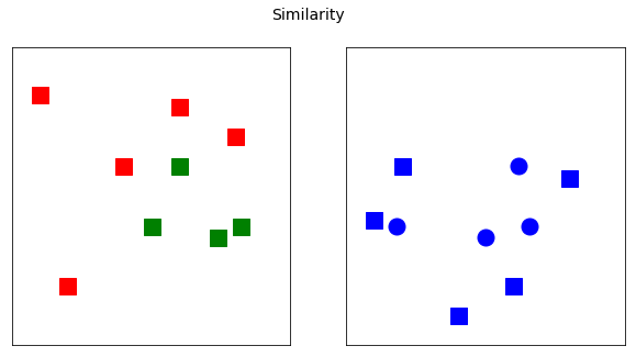
- Similarity - objects that share channels (colour or shape for example) are seen as grouped
- Enclosure - objects enclosed by boundary and/or area are seen as grouped
- Closure - within limits, open objects are perceived as closed
- Continuity - objects that align/flow are seen as continuous objects
- Connection - objects that are connected are seen as grouped
Proximity
Similarity
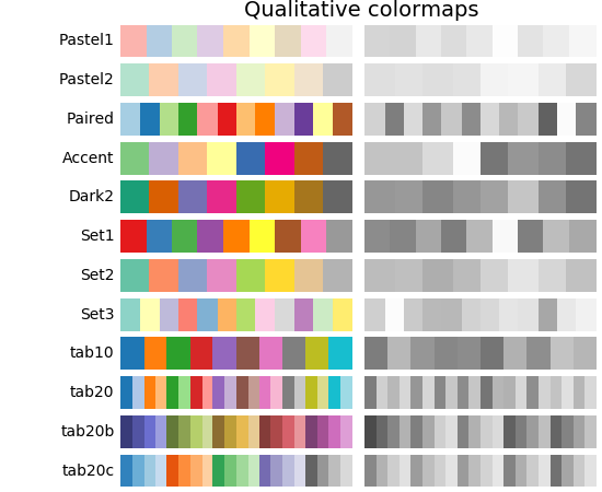
Colours for qualitative datasets
- Cynthia Brewer designed several sets of colours for plotting cartographic data
- More generally useful though
- Designed with B&W printing, colour blindness, perceptual uniformity in mind
- http://colorbrewer2.org
https://matplotlib.org/users/colormaps.html#colormaps
Conclusions
- Upgrade to matplotlib 2.0+ if you haven’t already! Has sensible defaults
- Don’t use Jet or rainbow color map!
- For data with positive/negative, use a diverging colourmap
- For qualitative data, use Brewer colours
Resources
- Set of Jupyter notebooks on data visualisation: https://github.com/UoMResearchIT/data-vis-truthiness-hurts
- Brewer colours for qualitative data: http://colorbrewer2.org
- Theory of colourmaps: http://peterkovesi.com/projects/colourmaps/
- Colourmaps in Matplotlib: https://matplotlib.org/users/colormaps.html#colormaps